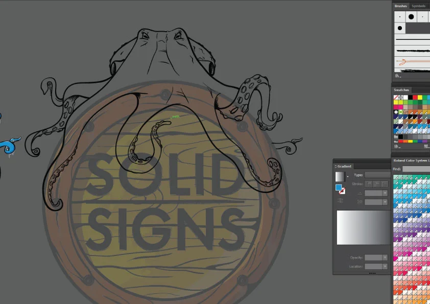
Without Awesome Signage some customers may not ever enter your store, it's true. You may be missing out on clients with that boring faded shopfront and sign pollution(too many dam cheap flags).
A bad Type/font choice alone can be enough to turn a potential customer away and definitely make a Typography snob hipster shudder!
When it comes to using your Signwriting dollars wisely as a start-up, re-brand or re-re-brand.
Consider the power of having LESS signage, opting for AWESOME Signage with the greater purpose of appeal and relevance to your niche or target market.
Throwing you name over 10 roadside banners is not a powerful as investing your Advertising/Signage budget into amazing signage for your business or brand. That is designed and branded to your market and future clients.
Its often the funky & amazing looking shops which are the ones we find ourselves inside puzzled. "This place is so cool" Even when we don't intend on a purchase, and sometimes feeling obliged to buy something.
The vibe of the exterior alone "zzrrrttt! like a tractor beam sucked me right in" regardless of what they sell.
That is the real missions of why we do signage the way we do.
An awesome sign for you that works, in return is a good sign for us.
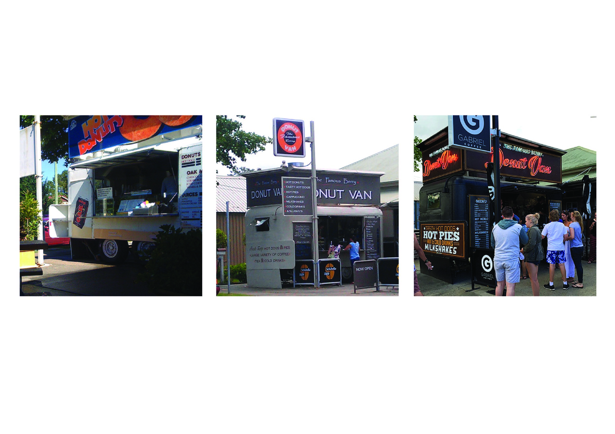
EXAMPLE: The Berry Donut Van.
If you have ever seen the traffic jams and people running across the road just for these donuts. You are the witness to the Pull Power of those Neons. I don't even eat donuts, but I drove past this place 4 times to admire those signs. Even witnessed a entire wedding party lined up.
The Berry Donut van through the years. Driving people nuts, without selling nuts
$$$ Dollars, everyone thinks of the dollar and budget is important. And that is our intent. To give greater value to every business by making smarter advertising decisions in terms of design and final product. There is a lot of sharks in this industry whom will push the a-frames, 5 flags and 17 banners (all which are items that fall apart in 12 months). They are easy to produce with no skill needed, hold little street cred and before you know it a big waste of funds on signs that wont last 12 months or survive through a slight breeze.
Investing $$$ in better signage is on par with having more signage. Its the long term savings, not having to update in 12 months or replace signs down the track.
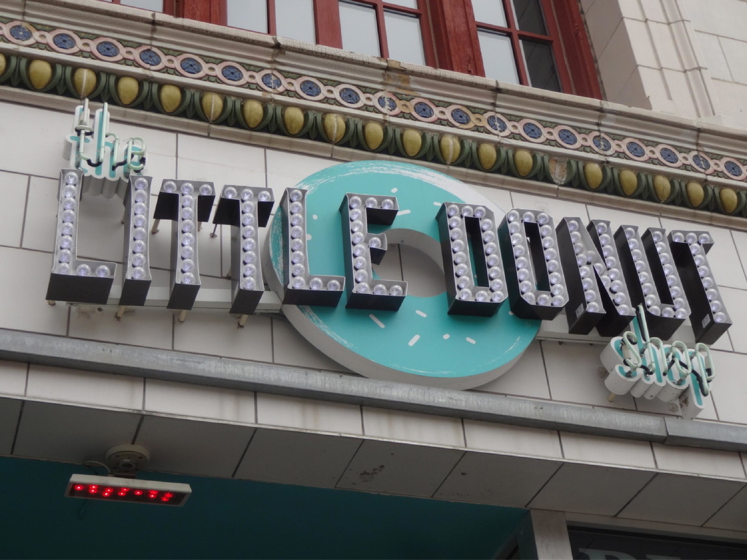
Not our work, Signwriter unknown
Let Better signage do its thing and you may not need print, radio or other advertising.
The buzz and word of mouth is of greater value alone. And its FREE ! ! !
Let your signage do the talking so you don't have to, and you can focus on all those customers pouring inside and rely on the signage to get clients in the door.
Not our work, Signwriter unknown
Old signage skills are on the comeback. Local and independent start ups are taking advantage of this as an edge over the corporation competitors.
Excessive signage (flags and shit) is NOT needed when you shop simply looks DOPE (had to say it).
This all reminds me of this guy many years back who won the World Barista Comp, buy selling the taste of the coffee to the judges over the actual product being good. Having the judges wrapped around his fingers with words only. Those donuts could be normal donuts, but their signage says the greatest damn donuts EVER and I'm going to eat it up!


