signs

Lets Talk About Shopfront Signs !

So your about to start a business and thinking about your shopfront?


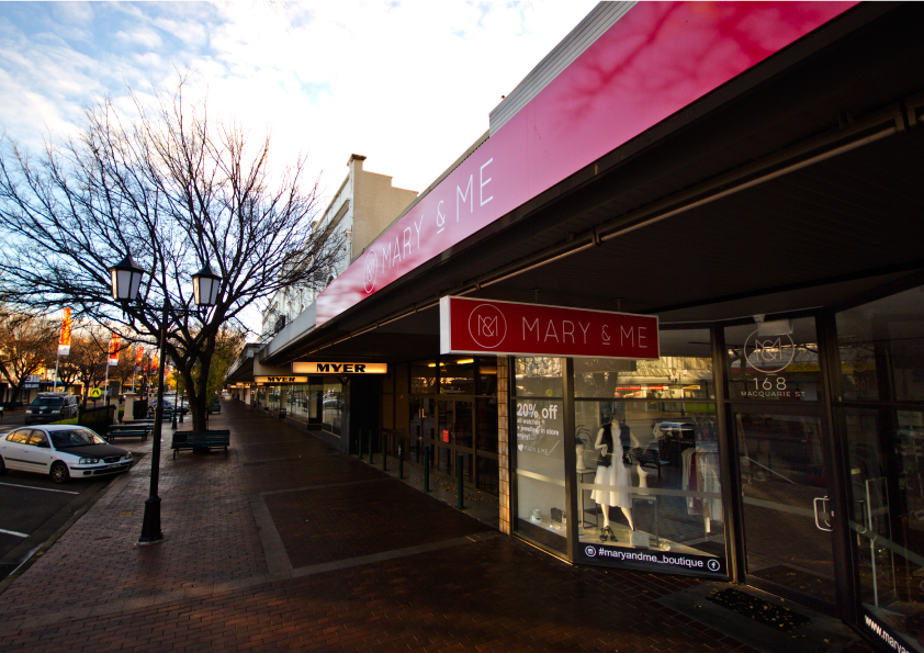
A big part of what we do is help start-ups and those in need of a re-brand get the most out of their Shopfront signage. From design, manufacture to install.

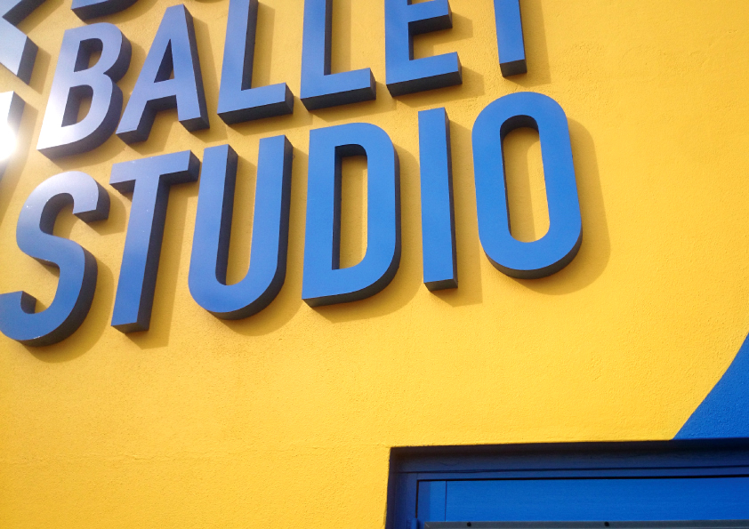
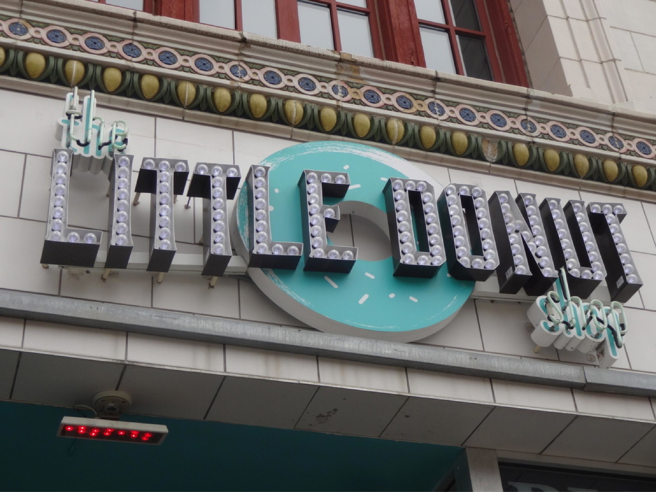
Colour choices are endless, Style options ranging from the modern 3d, and light-up letters, vinyl, print and the classic hand painted with traditional appeal.
Placement of logos can be big and bold or subtle to flaunt elegance and class.
The style you go with may determain alone who your clientele is going to be attracting the attention of a particular eyeball.
There is a lot to consider and its a tough call knowing where to begin to go in the right direction. That is where our skill, passion, background and knowledge is your going to be handy, very handy.

Where to start?

Being trade qualified we have surely done it all. Working with many local start-ups to design and install there shopfront signage as a crucial part of the branding. Appreciative and skilled in the old ways and equipped with all the modern gear. We got options, options, options!

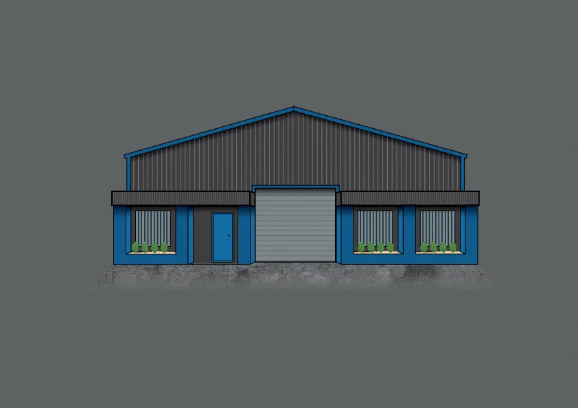
Where we begin, digital shopfront colour selection.

Where we begin, digital shopfront colour selection.

Design with purpose!

It all starts with a blank canvas, then colour choices, signage styles through to signage placement locations.

Its about getting the desired impact of your markets attention through your choices of signs that will give off those good vibes man!

Small with ohhh power

Small with ohhh power


Its not always the biggest who get attention, it's those who take the time to think with extra consideration to what appeals to their niche market that make a difference. Get the eyeballs and become the new top dog.


If your interested to know more about benefits of having your shopfront designed or re-branded (moving it out of the 90's, that was 17 years ago man! ).
Want to poke some eyeballs out. Then Increased attention tp shopfront design to appeal fto your customers is paramount in shopfront design.

Start ups

We know its competitive and are here to help you get established with impact.
(Or the cliche "standout from the crowd")
Your future success is our mission and awesome signs for you is an awesome sign for us too.
(pun intended)

Re-brands

For those considering a re-brand. There is always potential and benefits in freshening up your brand to appeal to modern tastebuds and gather a new generation of customers.  Investing in your business signage can create huge potential and welcome new customers

To see our clients still killing it in years to come is our purpose!
 

Get in Contact

new-ems.jpg

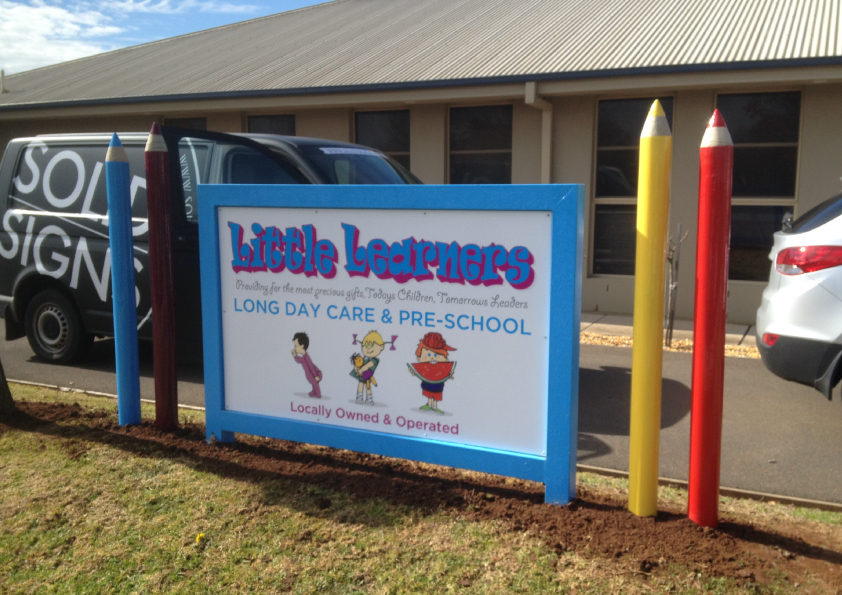
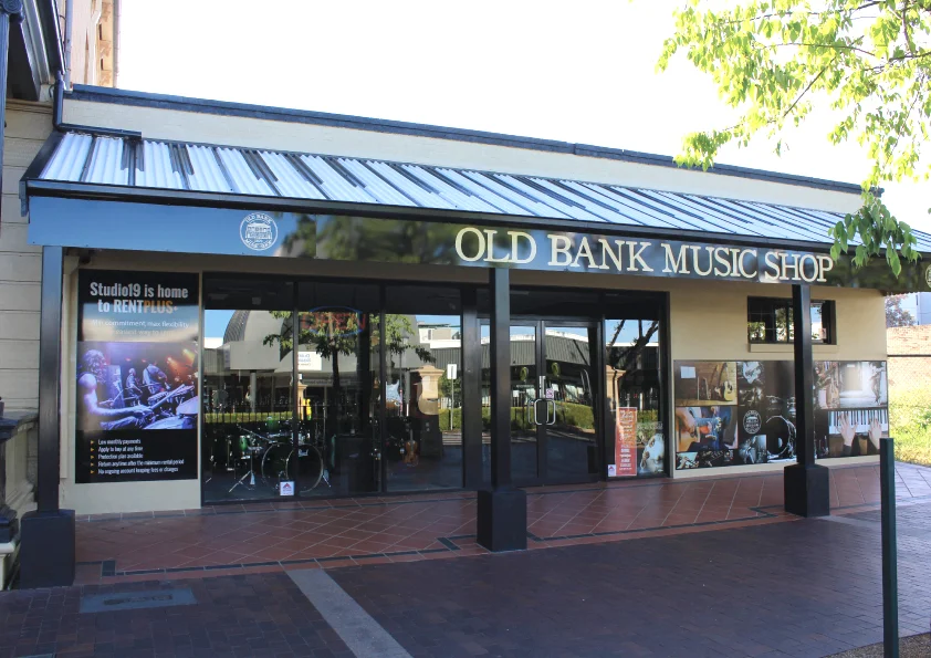
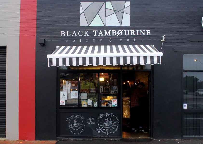
ABOVE, A range of projects we have had the pleasure of working with.

Locky Naef
Owner / designer / worker (everything) of Solid Signs

AWESOME signs trumps MORE signs anyday.

Without Awesome Signage some customers may not ever enter your store, it's true. You may be missing out on clients with that boring faded shopfront and sign pollution(too many dam cheap flags).
A bad Type/font choice alone can be enough to turn a potential customer away and definitely make a Typography snob hipster shudder!

When it comes to using your Signwriting dollars wisely as a start-up, re-brand or re-re-brand.
Consider the power of having LESS signage, opting for AWESOME Signage with the greater purpose of appeal and relevance to your niche or target market.
Throwing you name over 10 roadside banners is not a powerful as investing your Advertising/Signage budget into amazing signage for your business or brand. That is designed and branded to your market and future clients.

Its often the funky & amazing looking shops which are the ones we find ourselves inside puzzled. "This place is so cool" Even when we don't intend on a purchase, and sometimes feeling obliged to buy something.
The vibe of the exterior alone "zzrrrttt! like a tractor beam sucked me right in" regardless of what they sell.
 

That is the real missions of why we do signage the way we do.
An awesome sign for you that works, in return is a good sign for us.


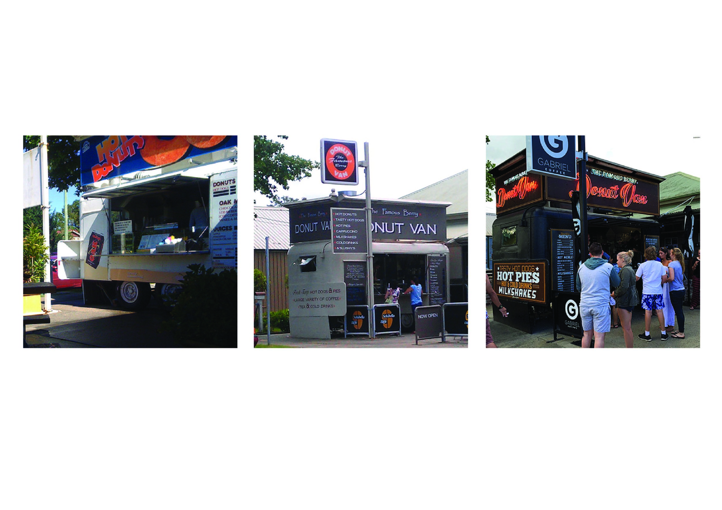
EXAMPLE: The Berry Donut Van.
If you have ever seen the traffic jams and people running across the road just for these donuts. You are the witness to the Pull Power of those Neons. I don't even eat donuts, but I drove past this place 4 times to admire those signs.  Even witnessed a entire wedding party lined up.

The Berry Donut van through the years. Driving people nuts, without selling nuts

The Berry Donut van through the years. Driving people nuts, without selling nuts

$$$ Dollars, everyone thinks of the dollar and budget is important.  And that is our intent.  To give greater value to every business by making smarter advertising decisions in terms of design and final product. There is a lot of sharks in this industry whom will push the a-frames, 5 flags and 17 banners (all which are items that fall apart in 12 months). They are easy to produce with no skill needed, hold little street cred and before you know it a big waste of funds on signs that wont last 12 months or survive through a slight breeze.
Investing $$$ in better signage is on par with having more signage. Its the long term savings, not having to update in 12 months or replace signs down the track.

Not our work, Signwriter unknown

Not our work, Signwriter unknown

Let Better signage do its thing and you may not need print, radio or other advertising.

The buzz and word of mouth is of greater value alone. And its FREE ! ! !
Let your signage do the talking so you don't have to, and you can focus on all those customers pouring inside and rely on the signage to get clients in the door.

Not our work, Signwriter unknown

Not our work, Signwriter unknown

Old signage skills are on the comeback. Local and independent start ups are taking advantage of this as an edge over the corporation competitors.
Excessive signage (flags and shit) is NOT needed when you shop simply looks DOPE (had to say it).

This all reminds me of this guy many years back who won the World Barista Comp, buy selling the taste of the coffee to the judges over the actual product being good. Having the judges wrapped around his fingers with words only. Those donuts could be normal donuts, but their signage says the greatest damn donuts EVER and I'm going to eat it up!

Let the awesome signage get clients in the door.


Handpainted Signs - we still got it!

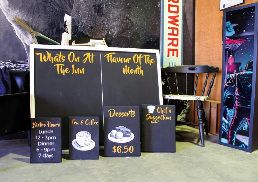
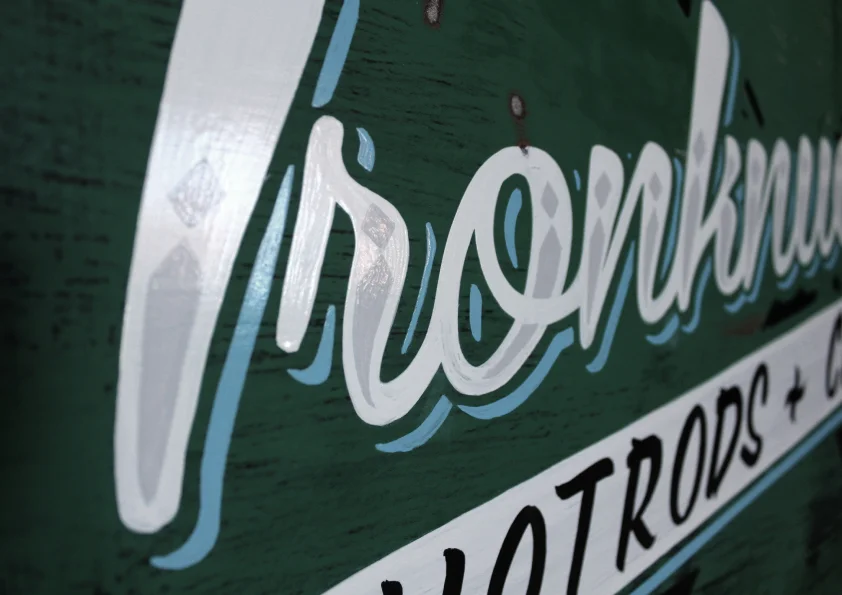
Along with all the "New School" Sign things we do, we are also trained and still work the "Old School" brush styles. We consider ourselves as a rarity in the modern Sign game as we have retained the old hand-painted Sign skills while still killing the new print/wrap era.

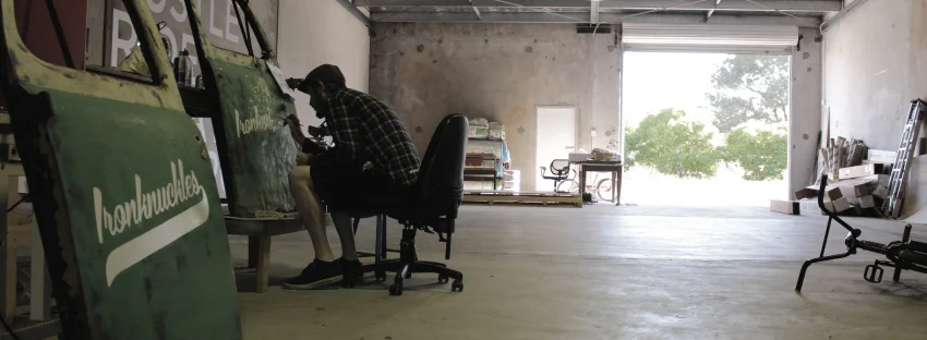
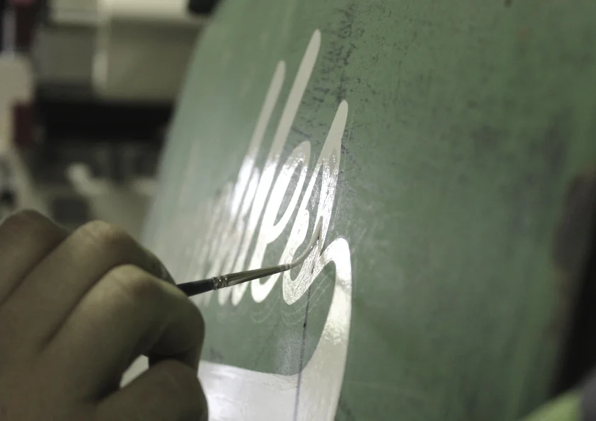
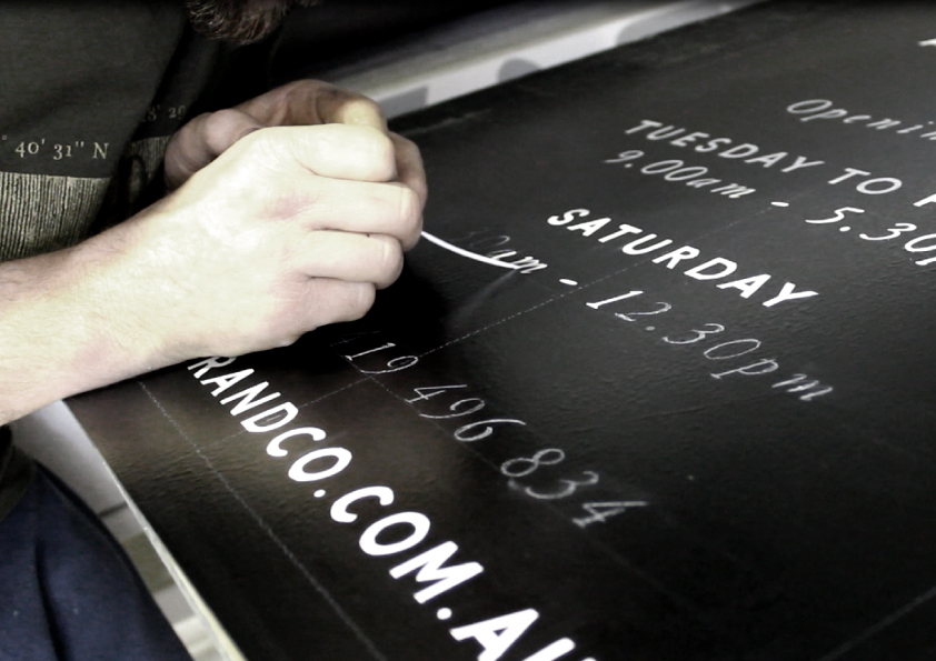
Bossman on the brushes. Hand painting signs in the Solid Signs workshop.

Bossman on the brushes. Hand painting signs in the Solid Signs workshop.

Being in the Signage Industry we believe its incredibly important to appreciate and embrace where the industry has come from and use that in modern day to be progressive.

Branding tip.
Make every job out do your previous. It will become the most valuable & free advertising you will ever have.

Below is a collection of Signs we painted over the past 3 weeks, with one job leading to another. A nice change of pace from sitting at a computer and operating machines.

Locky Naef - Owner and everything- Solid Signs


Signwriting has a deep and interesting history with some creative and interesting characters. Here is one of them below!